Shopping cart
{{ cart.product_name }} x {{ cart.product_cart_quantity }} pcs x {{ cart.product_final_price }} € {{ cart.product_sale_price }} €
Search products
The Power of Typography: How Fonts Shape Perception
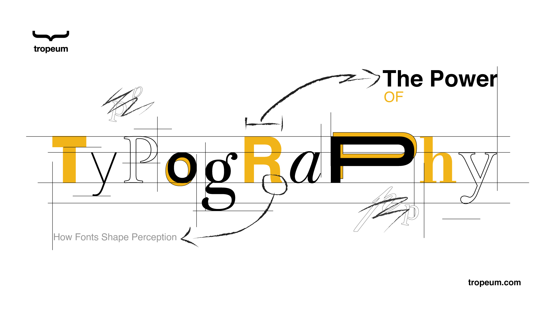
The Power of Typography: How Fonts Shape Perception
Effective typography plays a crucial role in building customer trust. Carefully selected fonts improve readability and convey professionalism, encouraging customer engagement. Consistency in typography across all marketing materials strengthens your brand identity cultivating loyalty and strengthening relationships with customers.
Why Typography Matters
Initial perceptions Are Crucial
A strong first impression engages the reader, motivating them to explore further, which ultimately leads to increased customer interest and higher conversion rates. If the text is visually appealing, clear, and easy to read, it creates a sense of professionalism and credibility, which builds trust with potential customers.
Enhancing Readability
Customers need to read and understand text as quickly as possible, and effective typography plays a key role in achieving this. By selecting the right font style, size, spacing, and weight, you create a smooth reading experience that reduces strain and improves comprehension. This helps customers engage with your message more easily, strengthening their connection to your brand.
Evoking Emotional Responses
Different typefaces induce specific emotional reactions, influencing how readers engage with the text. The careful selection of typography reinforces the intended message, enhancing the reader’s emotional engagement.
Strategies to Improve Typography
Select Fonts Intentionally
Choose typefaces that align with your brand’s message. Stick to two or three fonts to maintain visual consistency and professionalism. Each font should communicate the right mood and personality for your content and your brand.
Pro Tips:
Serif Fonts: They are well-suited for formal documents, print media, or any content that aims to convey professionalism, credibility, and trust. Serif fonts often feel classic, stable, and dependable.
Exemple: fonts such as Times New Roman, Georgia, and Garamond, evoke a sense of tradition, authority, and reliability.
Sans-serif Fonts: These fonts often feel approachable, contemporary, and easygoing, making them excellent for a wide range of professional and casual content.
Exemple: fonts like Helvetica, Arial, and Open Sans are modern, clean, and minimalist. They communicate simplicity, clarity, and efficiency, making them ideal for digital platforms, websites, and applications.
Script Fonts: These fonts are best used sparingly for invitations, headlines, or logos to evoke feelings of sophistication, artistry, and individuality. They add a personal touch, but can appear informal if overused.
Exemple: fonts such as Brush Script and Pacifico have a cursive, handwritten quality that conveys elegance, creativity, and personalization.
Display Fonts: These fonts often convey a sense of boldness, assertiveness, and urgency, ideal for content that requires a strong visual impact.
Exemple: bold and striking fonts like Impact or Bebas Neue are designed to grab attention. They communicate strength, excitement, and energy, making them perfect for titles, promotional materials, or advertisements.
Establish a Hierarchy
A strong visual hierarchy helps guide the reader’s eye, ensuring they can easily navigate through the content and understand its structure. Effective hierarchy uses variations in font size, weight, style, and spacing to prioritize information and direct attention.
Pro Tips:
Headings and Subheadings: Use larger, bolder fonts for main headings to grab attention immediately. Subheadings should be slightly smaller but still distinct from the body text. This guides the reader through the structure of the content, allowing them to identify the key points without getting lost in the text.
Body Text: The body text should be easy to read and placed at a size and weight that doesn’t compete with headings. By maintaining a smaller size and lighter weight, the body text supports the content without overwhelming the reader. Consistency in line spacing (leading) and paragraph breaks can also make the body text easier to read.
Use of Color and Contrast: Differentiate headings, subheadings, and body text by varying their color and contrast.
For example, dark text on a light background ensures readability, while using a lighter color or a different hue for subheadings can subtly separate them from the main body without distracting from the overall flow.
Bold and Italics: Use bold for important terms or phrases to highlight key concepts, and italics for emphasis or to introduce quotes or foreign terms. These subtle changes help signal to the reader what to focus on, guiding them through the text in a logical order.
Whitespace and Spacing: plays an important role in hierarchy by giving content room to breathe. Proper margins and spacing between paragraphs and sections not only make the content more visually appealing but also ensure that the eye naturally moves from one section to the next. Ample space between headings, subheadings, and body text helps delineate the structure and guides the reader smoothly through the material.
Ensure Strong Contrast
Easy-to-read text is crucial for attracting and retaining readers, which in turn can improve the effectiveness of a product or service’s marketing. When text is clear and quick to understand, it allows readers to absorb information faster, leading to a more engaging experience and, ultimately, a greater likelihood of conversion. Ensuring strong contrast between text and its background is essential for making content readable and impactful. Without sufficient contrast, the text may blend into the background, making it harder for readers to focus on and comprehend the message.
Pro Tips:
Text vs. Background Color: For text to stand out, there needs to be a significant difference in brightness and hue between the text and the background. A common rule is to use light colors for dark backgrounds and dark colors for light backgrounds.
Exemple: The 60-30-10 Rule is a simple and effective guideline for creating visually balanced and harmonious designs. It suggests dividing your color palette into three parts: 60% should be the dominant color, 30% the secondary color, and 10% an accent color.
Avoid Low Contrast Combinations: Some color combinations, such as light gray text on a white background or dark green text on a black background, create low contrast and make reading challenging. These combinations may look stylish but compromise legibility, especially on digital screens or in low-light settings.
Color Harmony in Composition: Color harmony is the balanced use of colors to create a pleasing visual experience. To achieve color harmony in typography, choose colors that work well together and reflect the overall mood of the content.
· Complementary Colors: These are colors that sit opposite each other on the color wheel (e.g., blue and orange, red and green).
· Analogous Colors: These are colors that are next to each other on the color wheel (e.g., blue, blue-green, and green). Using analogous colors for text and background creates a more harmonious and subtle contrast.
· Monochromatic Scheme: This involves using different shades, tints, and tones of the same color. While this scheme provides a uniform and harmonious look, be mindful of using varying shades for text and background to maintain sufficient contrast.
· Triadic Colors: Triadic color schemes involve using three evenly spaced colors on the color wheel (e.g., red, blue, and yellow). This can provide vibrant, balanced contrast when applied thoughtfully in typography.
Maintain Consistent Alignment
Consistent alignment plays a crucial role in creating a professional, polished presentation of your content. Keep your text aligned consistently throughout the content. Left-aligned text is the easiest to read for most languages, particularly for long bodies of text.
Pro Tips:
Align Text to a Grid: A grid is used to create balance and ensure a professional look by providing a structured framework for aligning text. Whether the text is left-aligned, centered, or right-aligned, using a grid ensures consistency and prevents the layout from appearing scattered or disorganized.
Choose the Right Alignment for the Context: The alignment of your text should depend on its context. Left-aligned text is the most common and easiest to read, especially for large bodies of text, as it allows the reader’s eye to flow naturally from left to right. Centered text can be effective for headlines, titles, or short blocks of text where emphasis is needed, but it can make long paragraphs more difficult to read.
Important to keep in mind!
Text alignment should be adapted to the reading habits of the target audience. How people read a text largely depends on the language and its direction. In languages like English, Spanish, and French, readers begin from the top-left corner and read left to right. Conversely, in languages such as Arabic and Hebrew, which are read from right to left, right-aligned text is more appropriate. Additionally, Japanese text may be arranged either vertically or horizontally, depending on the context. Aligning text in accordance with these cultural reading patterns ensures clarity and effective communication.
Extra pro tip
Optimize Spacing
Proper spacing is essential to make text easy to read and visually appealing. This includes three main aspects: kerning, leading, and tracking.
Kerning refers to the space between individual letters. Adjusting kerning ensures that letters are neither too close nor too far apart, making the text more readable. For example, if the letters "A" and "V" are too close together, it can be hard to read, so adjusting the spacing can improve clarity.
Leading is the space between lines of text. If the lines are too close together, the text can feel cramped and hard to follow. On the other hand, too much space can break the flow of the text. The right leading helps the reader’s eyes move comfortably from one line to the next, making the text easier to read and more inviting.
Tracking is the overall spacing between all characters in a block of text. Adjusting tracking helps balance the density of the text. For example, in a large block of body text, you might adjust the tracking to make the words feel evenly spaced and less dense, which makes reading easier.
The Significance of Punctuation in Typography
Punctuation serves as a vital component of typography, directly influencing comprehension and readability. Proper use of commas, periods, and quotation marks ensures clarity and coherence in written communication.
Best Practices for Professional Punctuation
Use Commas Correctly
Commas facilitate readability by breaking up sentences. Avoid overuse and ensure proper placement to prevent ambiguity.
Master Period Usage
Concise, well-structured sentences improve readability. Thoughtfully applied periods ensure clarity and digestibility.
Employ Colons and Semicolons Wisely
Colons introduce lists or explanations, while semicolons connect closely related ideas without requiring a new sentence.
Use Quotation Marks Purposefully
Apply quotation marks correctly for direct speech, citations, and titles, preventing unnecessary text clutter.
Limit Exclamation Marks
Excessive exclamation points can detract from professionalism. Reserve them for appropriate emphasis.
Conclusion
Typography is a powerful tool that shapes the way your message is perceived and can significantly impact customer engagement and brand trust. By choosing the right fonts, spacing, and alignment, you create a smoother reading experience that resonates with your audience.
Do you have any questions about using typography on promotional products?
Feel free to ask in the comments below.